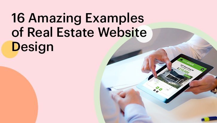
16 Amazing Examples of Real Estate Website Design
Since the dawn of time, human beings have appreciated beauty and effectiveness. As a result, we’ve kept an upward trend of development in both art and technology.
This same trend continues in the virtual world. When people find a beautiful website that caters to their specific needs, they keep returning to it. The real estate industry is no exception. With 5.18 billion people already using the internet, it is nearly obligatory that all businesses, including real estate agencies, have their websites up and running.
Since a person spends around 6 hours 40 minutes online each day, it is only sensible that a website with fantastic aesthetics and value delivery will be able to rake in and retain more customers. It’s of paramount importance that a real estate agent knows what components of their website make it stand out.
Since having a website designed and developed can be a significantly daunting task, we have decided to present to you websites that are already successfully running. If you like any one (or more) of them, all you have to do is share the link with the web design company of your choice. If they are competent, building a website based on your choice samples (and providing custom features) from our site list would be no challenge for them.
Thus, we have found out over 60 running websites. We have ranked them on the overall design, visual aesthetics, user interface, user experience, colour choice, and features provided.
Our filtering process boiled our initial list to 16, which, according to us, are the best real estate website designs.
Have a look and decide which ones are to your liking.
1. Belville
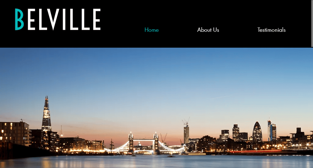
What sets Belville apart is its darkened background. The moment a visitor lands on Belville’s real estate agent website, their attention is drawn to a captivating photograph of the sprawling London cityscape, stretching across the full width of the homepage. The heading is simple, and comparatively larger fonts have been used for the Enter CTA, placed below the heading.
The prominent display of the collection of testimonials directly on the homepage ensures that positive feedback takes centre stage. With only three sections- home, about us, and testimonials placed at the top of the homepage, the navigation bar seems clutter-free and easy to navigate.
Website: https://www.belville.co.uk/
2. REX Real Estate
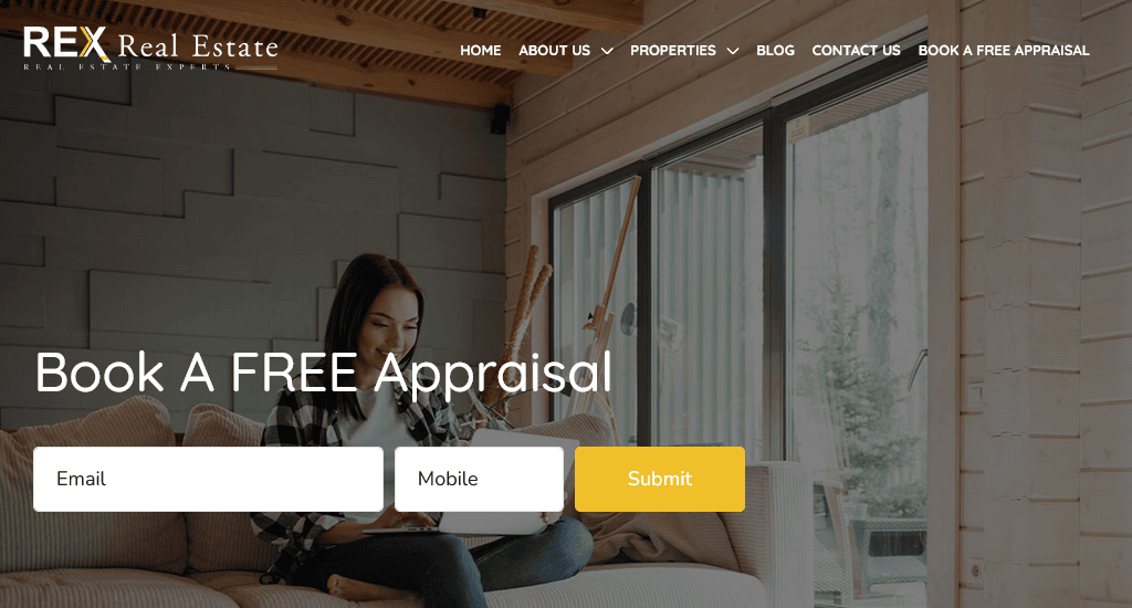
For REX Real Estate, user experience was a key driving factor when having their website designed. The white colour scheme and the clean design go hand in hand with the hero banner image featuring a beautifully lit family house where a smiling lady is sitting on the couch comfortably. This gives potential clients a clear sense of minimalist style.
In their headline, they have chosen to display home, about us, properties, blog, contact us and book a free appraisal. The free appraisal form is also on display with a quick mouse movement. Scrolling down, visitors can check out the latest property listings for sale. In the mobile version of the site, these elements are all within the reach of the thumb. This feature makes it very easy for visitors to interact with their website.
Website: https://rexrealestate.com.au/
3. Toll Brothers City Living
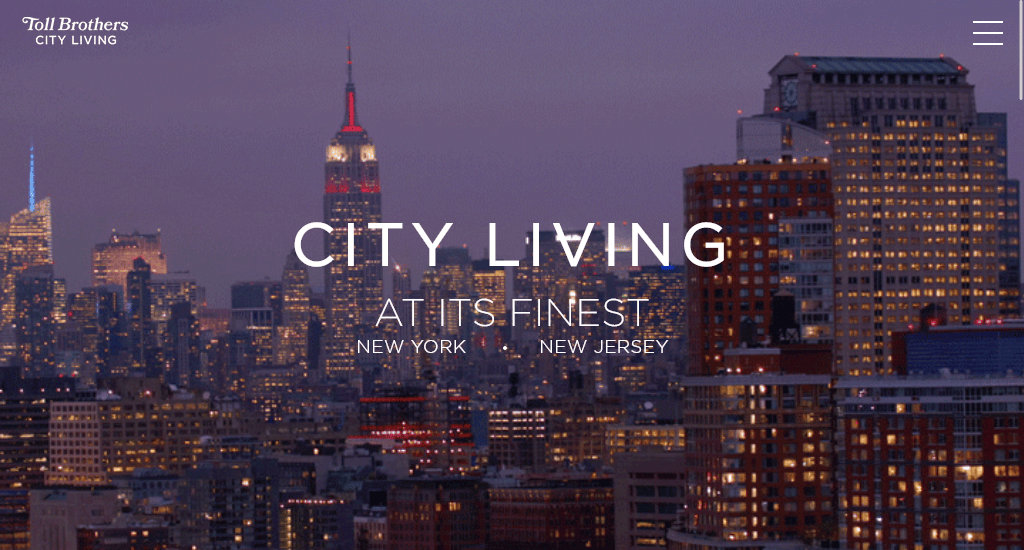
The moment you log onto their website, Toll Brothers City Living welcomes you with a video chopper-view of the dazzling skyline of New York City! It also boasts one of the cleanest home pages in the world.
Toll Brothers City Living has managed to achieve this in three ways. It placed all relevant and necessary navigation bar items into a hamburger-style menu while making the entire bar hover-sensitive. This way, when the mouse is moved to the top region of the site, the hamburger opens up, revealing its contents. It also used a heading and sub-heading, which are short, to the point and as elegant as the skyline in the video.
Their enhanced emphasis on aesthetics will leave any visitor spellbound, with no choice but to scroll down or click scroll down Portfolio to explore what’s offered!
Website: https://www.tollbrotherscityliving.com/
4. Home Light
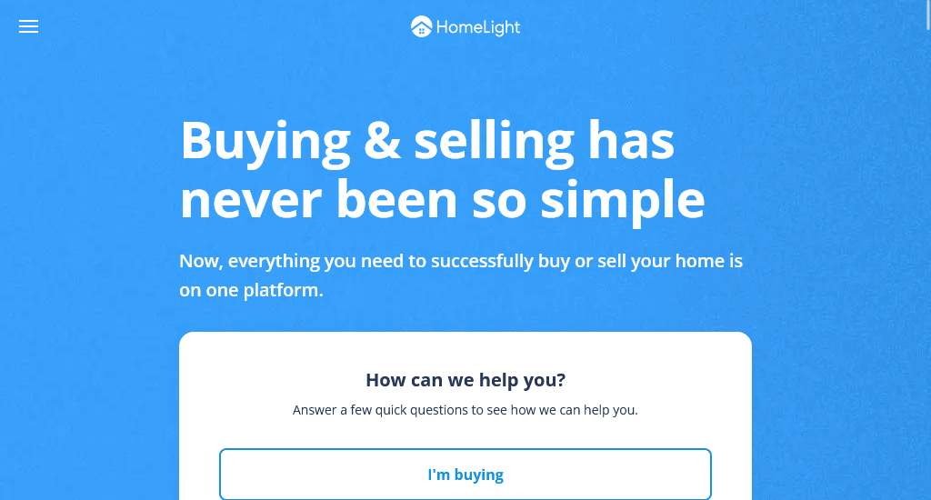
Unlike its predecessor, Home Light Florida has decided to keep its above-the-fold content as clean as possible. The hero banner, which shows an animated neighbourhood in Florida, is actually the background against which all content has been placed. This content only includes a simple yet elegant headline, a sub-heading and a field where visitors can choose whether they are looking for help for buying, selling or both, which gives the site an uncluttered look.
Since the embed form is at the centre, visitors would feel compelled to type. Furthermore, all the buttons at the top are actually drop-down menus. This also contributes to the clean feel of the first contentful page.
Their key feature, HomeLight Home Estimates, which lets people find an estimated sale price for their house in two minutes and also exposes their house to pre-approved cash buyers, is embedded in the SELL button at the top.
Website: https://www.homelight.com/
5. My Agent Finder
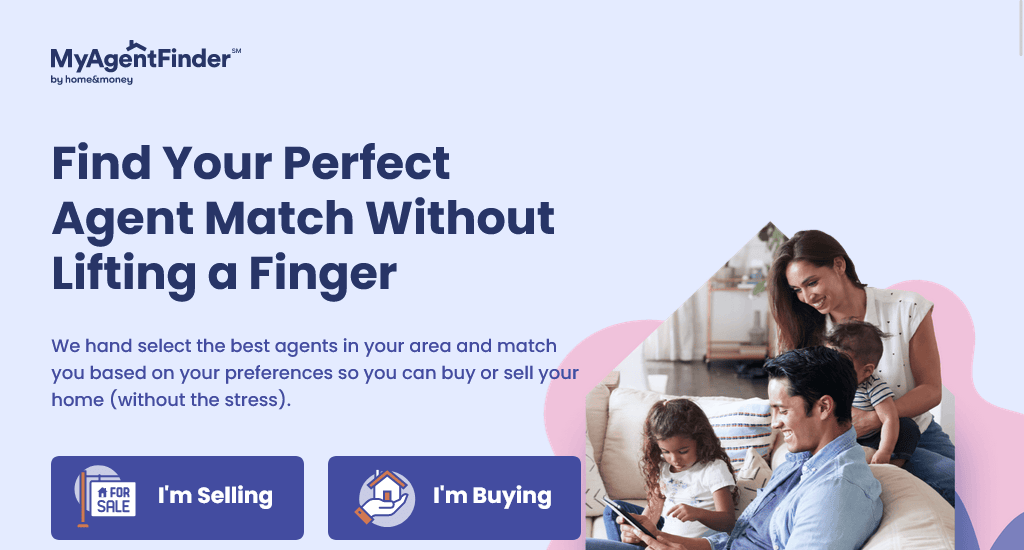
Keeping lead capturing at the core of its site objective, MyAgentFinder has placed the I’m selling, and I’m buying CTAs at the centre of the home page. The buttons open up a new page. On this window, you have the option to choose the type of property you are looking for, the expected time, and the price range you would be comfortable with.
The homepage boasts a unique design as at the top, there aren’t any buttons distracting a visitor from selecting whether they want to sell or buy. The banner image evokes both professionalism and personality. They strategically place social media buttons in the right corner of the footer, taking their visitors directly to their social media accounts.
Website: https://www.myagentfinder.com/#/
6. Foxtons
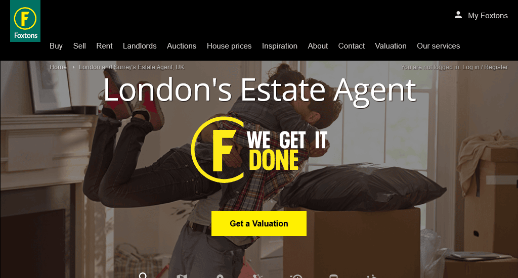
We instinctively associate our homes and neighbourhoods with peace, calmness and prosperity. The video background of Foxtons, UK, speaks to this instinct.
The same theme led Foxtons to choose yellow and green as the primary colours for their logo, CTA and so on. The Buy button has a drop-down menu allowing visitors to choose the duration they want to rent a house.
Like this button, the search field is multi-functional in that it lets you search for a home by area, postcode, school or station. Right over this bar is the search criteria, which lets you find houses based on your location, travel time, etc.
In addition, this website boasts a one-line sub-heading and rating based on reviews from over five thousand people.
Website: https://www.foxtons.co.uk/
7. Brookfield Residential
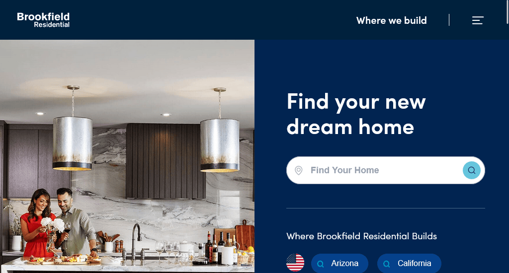
When planning to buy a house, you’ll most likely be looking for blue sky, green-groomed fields or open-deck houses. Brookfield Residential shows you this when you visit their website, generating desire and immediately making you hungry for information about houses. Thus, they have placed the Where We Built button and hamburger menu at the top right of their site.
As soon as visitors land on the homepage, they will encounter a search bar to find a home based on their current location. Besides the easy search feature, they have placed all their blogs’ informative content along with other relevant buttons such as Explore Promotions, Schedule a Tour, and Tell Me More, which facilitate the seamless customer experience.
Website: https://www.brookfieldresidential.com/
8. Fisher Real Estate
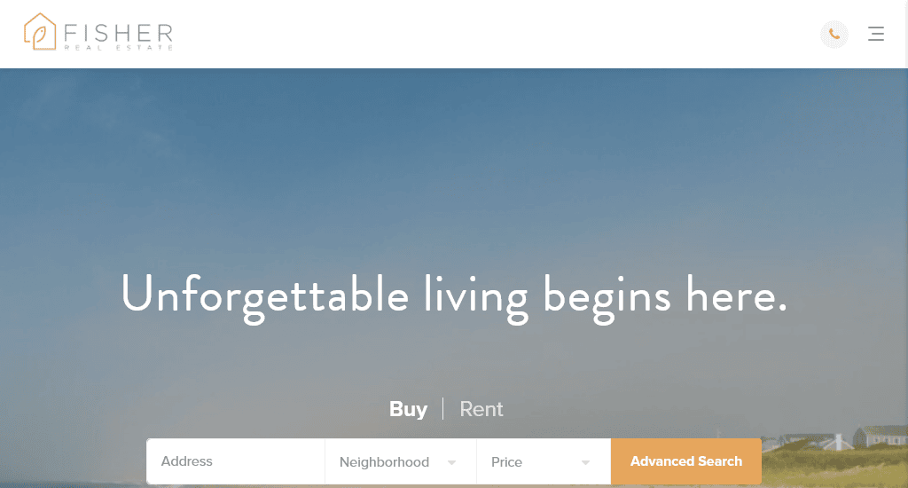
In an attempt to deliver an excellent user experience, FisherNantucket has taken several initiatives.
One is putting market-related information such as market analytics, market reports and recent activity all bundled into the menu labelled Market Insights. The menu bar also covers buy, rent, sell, team, discover Nantucket, stories and contact. In addition to beautiful and disciplined aesthetics, it implies their long-standing industry experience.
Another element is the hero image that comes as a landscape photo, which is actually the background against the advanced search bar that has been placed in the middle. This search option lets visitors type their address and choose the neighbourhood and price they would be comfortable with.
Below, there is Discover Nantucket and the market activity section. The properties can be viewed by status along with featured properties. Each picture has information such as the location and number of bedrooms and bathrooms. Additionally, the pictures are clickable and lead to corresponding properties.
Website: https://fishernantucket.com/
9. JOHN TAYLOR
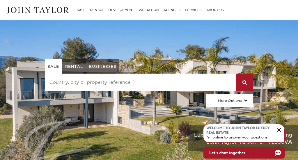
When it comes to creating value while retaining an engaging look, JOHN TAYLOR has done a fine job. After logging onto their website, visitors are greeted with a slideshow of images showing some majestic architecture and beautiful properties.
The above-the-fold content only features a search bar that can be used to find real estate for sale and rent. The buttons at the top are hover-sensitive. That means you do not need to click on them to open the drop-down menus. Among these buttons, one at the top right lets you choose the language for the site. These are placed against a white background so they do not distract attention from the centre.
The More Options button below the right end of the search bar opens up a small box on the same page. On this window, you have the option to choose the type of property you are interested in, the number of bedrooms you want in it and the range of budget you would be comfortable with.
Website: https://www.john-taylor.com/
10. Residences-Immobilier
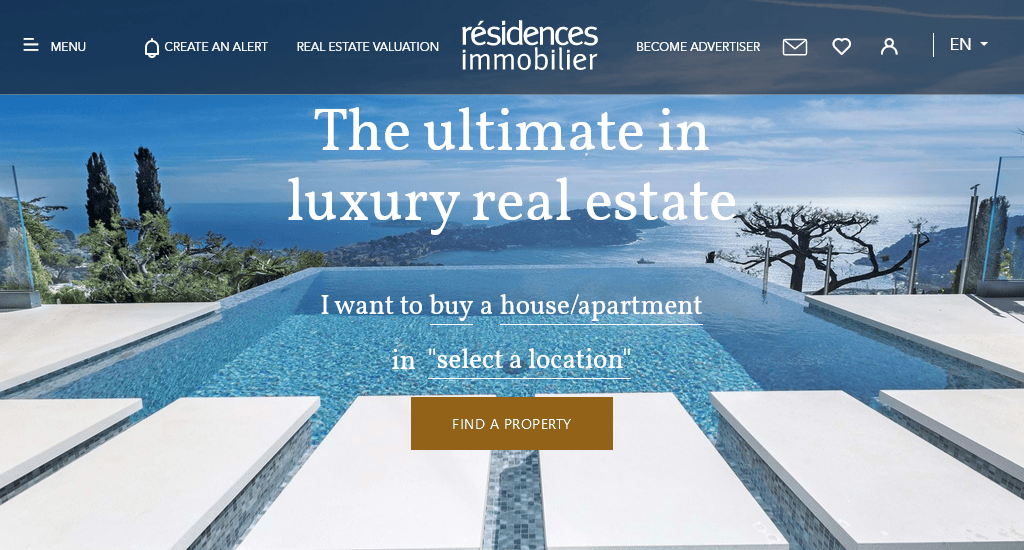
Even though Residences-Immobilier does not welcome its visitors with a video in the hero banner, it more than makes up for this with a clean navigation bar. With only a few items in small font placed at the top left and right corners, the nav bar is rendered almost transparent. In this way, maximum user attention can be directed to the FIND A PROPERTY CTA.
Let’s talk about their search bar. When you click on the CTA, a search bar with multiple criteria (buy/rent/rent for holidays) opens up on the same page.
The hamburger menu has many important options for visitors, such as finding a property, estate agencies, apartments and houses for sale, magazines, contact options, etc. As Residences-Immobilier specialises in luxury properties, they have chosen their site hero banner images accordingly.
We can see breathtaking pictures of the Mediterranean, an over-the-edge suspended swimming pool facing the horizon and a magnificent luxury home surrounded by greenery.
Website: https://www.residences-immobilier.com/en
11. Domain
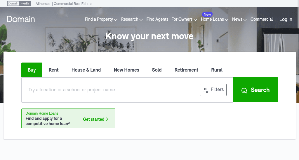
Unlike others on this list, Domain has put relatively little emphasis on aesthetics. However, they have more than made up for it with extensive value delivery in the content-full print! In fact, that is the reason they are on this list.
First of all, you have the means to find home loan lenders easily. Furthermore, you’ll be able to find repayment, stamp duty and equity fees using on-site calculators.
Domain also lets you make an informed decision through their research materials. These include advice, reports, sold properties and property-price estimates. These can be found in the Research tab in the navigation bar.
That is not all. On the site, you can find information on property, agents, home loans, news and commercials through the navigation menu.
The button titled Filters on the immediate left of the large green Search button lets you open up a pop-out window when clicked. This window contains a range of filters to narrow down your search. Have a careful look at these in the pictures below. These improve user experience and would be worth implementing on your real estate website.
Website: https://www.domain.com.au/
12. Real Estate
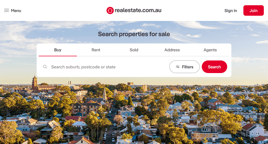
The best real estate websites have one basic feature in common. They provide users with the option to search for a property by type, minimum and maximum number of bedrooms. RealEstate.com.au, in its attempt to be useful to its visitors, has incorporated this feature as well, along with some more.
What helps RealEstate.com.au stand apart from its rivals is that the navigation bar is well-organised, and the Join section has been coloured separately to direct more attention towards it. Last but not least, RealEstate.com.au allows visitors to search for roommates and rooms for rent; the Share button takes people to the corresponding page.
As you can see, they have taken great care in choosing the background image. This picture speaks of friendship, sharing and fun, all associated with having roommates.
Website: https://www.realestate.com.au/buy
13. Tommy’s Real Estate
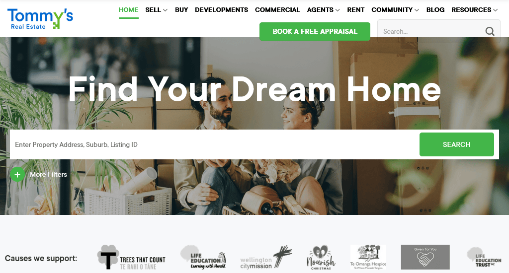
When deciding to buy or rent a house, a key factor for most people is the distance of the property in question from his/her workplace. Keeping that in mind, Tommy’s has placed a drop-down menu button in the centre position of their website that allows their visitors to choose their office location when searching for houses.
Their home page background selection is splendid as well! All the pictures they have chosen speak of the family fun and happiness people expect from their homes.
Additionally, they have also strategically placed the search bar with more filter options so that their valued visitors have access to a greater number of search criteria. Upon clicking, it pops out a window while keeping the user on the same page.
This window opens up with more filters for search convenience. These filters include city, suburb, property type, minimum and maximum price, number of bedrooms and baths and so on.
One of the items worth mentioning on their website is the highly visible “BOOK A FREE APPRAISAL” button, standing out as it is green set against a white background. This is likely one of the reasons behind their high conversion rate.
Website: https://www.tommys.co.nz/
14. The Home Like
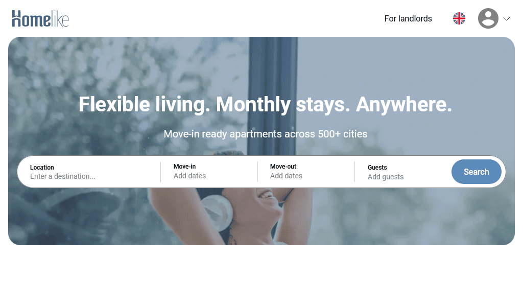
If you want an example of a mesmerising website that also retains enviable levels of usefulness, you’ll want to visit The Home Like. The background shows a neat studio apartment, conveying a sense of comfort and taste.
Scrolling down towards the trending cities section, visitors will find several property listing locations. To enhance user experience another notch, they have made it possible for visitors to contact them via the one-click buttons in the picture above. People will naturally focus attention here. A simple yet elegant way of increasing user engagement!
What must be mentioned is that on the immediate left of the search button on the home page is the Move-in date and Move-out date field, which pops out a calendar when clicked. This is very helpful for people who are in a hurry to relocate. Also, one can add the number of guests, whether adults, children or toddlers.
At the bottom of the first fold, we can see the key features of their services, which makes placing trust in them that much easier!
Website: https://www.thehomelike.com/
15. Verde Real State
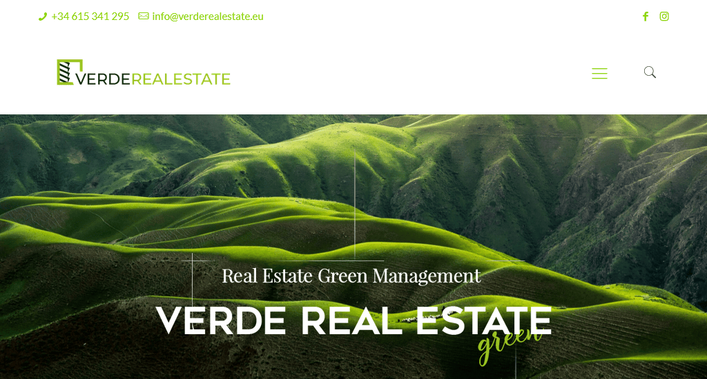
A simple picture speaks a thousand words. Verde Real State has placed an image of magnificent green mountains in the hero banner section. As Verde Real State supports and projects sustainable development through market-based processes, the picture itself represents its motto.
There are also buttons on the navbar that allow users to contact Verde Real State via email or phone. At the bottom left, there is also the live chat button, so if users have any queries, the people at Verde Real State are just a click away.
To make the site more usable, there is an Advanced search button above the hero image, with the means for people to search for special properties or facilities like sports, gastronomy, nature, history and so on.
Website: https://verderealestate.eu/
16. HAR
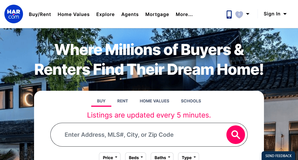
As well as trying to value pack their website, HAR has placed great emphasis on aesthetics. The brightly lit bungalow on the home page is evidence of their exquisite taste!
As if that weren’t enough, they have the option for visitors to search for houses by drive time, school locations and information in addition to sale/rent options, minimum and maximum price and the number of bedrooms and baths.
To take user experience a level above others in the industry, the More Filters button takes visitors to another page with an extensive list of search criteria, which include architecture style, property size, and number and type of garages.
It also lets you choose amenities such as a media room, spa, sprinkler, wheelchair access, study room, private pool and many others.
Website: https://www.har.com/
Conclusion
Every niche is unique, just like every person is unique. The website examples in this article are not to be copied exactly; based on the data you have on the people in your area, you can customise your website so that it aligns with their preferences.
Remember, forming good relationships with your customers will always be important if you want to be a long-term player; your website plays a crucial role in that, so take measures to build a website that facilitates such relationships. And enjoy the fruit of your success!
You read a lot. We like that
Want to take your online business to the next level? Get the tips and insights that matter.