Best Pharmaceutical Website Design Examples for 2024
In today’s modern marketing world, for any business, from retail and ecommerce stores to restaurants and food services to educational institutions to professional services, a website serves as a central hub. And a pharmaceutical company is no exception.
A pharmaceutical website is no longer used just as a showcase element. Customers are already assuming that you have a website, and a significant number of them will be reluctant to transact with your company if you lack a strong online presence. So, if your pharmacy does not have an engaging digital footprint, you might be losing out on potential sales.
If you want inspiration to build your pharmaceutical website, explore our collection of the finest pharmaceutical web design ideas to craft the perfect look for your project.
Why does a pharmaceutical company need a good website?
How important is it for a pharmacy to own a website? In a word, the answer is very. Increased online visibility, improved efficiency to increased sales, the list of having a well-designed and high-functioning pharmacy website goes on.
Most of the time, prospective customers end up getting intimidated by the strict regulations and scientific jargon of this industry. Hence, having a user-friendly website with a personable tone helps visitors who have minimal pharmaceutical background.
Also, when you prominently showcase certificates, regulatory approvals and other compliance information on the websites, it showcases transparency while building confidence in the business’s legitimacy. On top of that, a well-organised site allows users, from patients to researchers to professionals, to quickly find the information they are looking for.
1. Merck
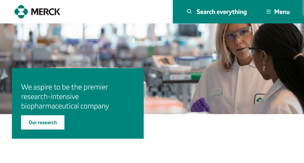
Website: https://www.merck.com/
Merck & Co., Inc. is a premier research-intensive biopharmaceutical company working to deliver innovative health solutions. The company’s website highlights its commitment to oncology, vaccines, infectious diseases, and more.
It provides a prominent section for key areas such as company information, research, products, patient resources, careers, investors, and media. The homepage prominently displays engaging visuals and clear calls to action, such as exploring their research, patient support, and sustainability efforts.
Key design elements:
- User-friendly navigation
- Clear call to action
- Captivating visuals
- Responsive design
2. Pure Encapsulations
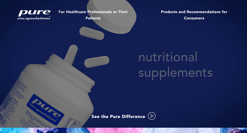
Website: https://www.pureencapsulations.com/
Pure Encapsulations website’s design effectively communicates its core values of purity, quality, and social responsibility, creating a positive user experience for visitors. One of the special design features of this website is that it clearly separates the two main user groups: healthcare professionals and their patients and regular customers searching for products and advice.
As soon as you enter the homepage, the division is very easy to locate at the top. Then, the layout also seems pretty minimalist, with a lot of use of white space. This makes it easier for visitors to focus on the key content with fewer distractions. Also, the use of a simple colour scheme and clean typography boosts the overall aesthetic appeal of this website.
Key design elements:
- Minimalist layout
- Consistent branding
- Engaging multimedia
- Transparent information
3. Honeybee
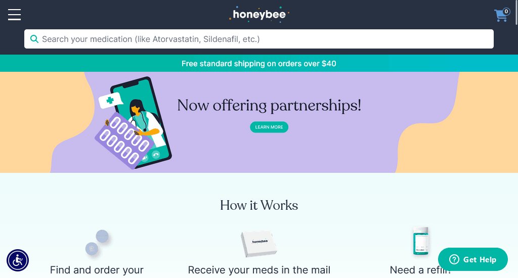
Website: https://honeybeehealth.com/
Incorporating animated graphics, such as the rotating pattern in the hero section, adds a dynamic touch to the overall aesthetic, making the website visually engaging and memorable for the users. Also, the use of bright pastel hues against a white background instantly grabs the visitors’ attention while conveying a sense of vitality and freshness, which is fitting for a health-related platform.
Honeybee’s website also includes several accessibility features, such as high-contrast options, scalable fonts, and keyboard navigation shortcuts. The menu is well-organised, with clear categories and labels, enhancing the overall user experience.
Key design elements:
- Eye-catching colour scheme
- Engaging animated graphics
- Responsive design
- Accessibility features
4. MedExpress
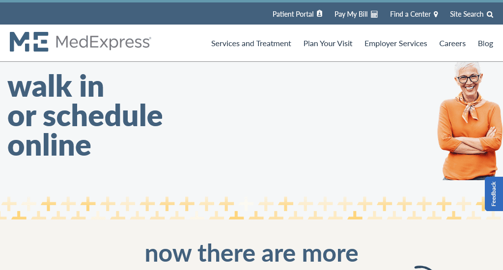
Website: https://www.medexpress.com/
The website seems to have a straightforward navigation structure, with main categories such as Services and Treatment, Plan Your Visit, Employer Services, Careers, and Blog prominently displayed. The website features quick facts such as the number of medical centres, average wait time, and number of services offered.
This provides users with essential information at a glance, helping them make informed decisions about seeking care. A dedicated section highlights the company’s commitment to patient safety, including compliance with over 600 care standards and accreditation from The Joint Commission.
Key design elements:
- Clear call-to-action
- Easy navigation
- Service Overview
- Dual access options
5. Takeda

Website: https://www.takeda.com/
All the information on this website is organised into clearly defined sections with headers, making navigation intuitive. The navigation bar is placed at the top, and the subsections are accessible via dropdown menus, enabling users to find specific information quickly.
The use of high-quality professional images helps humanise the brand while making the content more engaging. A dedicated section outlines Takeda’s key therapeutic areas. It clearly showcases the company’s main research and development priorities, such as Gastrointestinal and Inflammation, Rare Diseases, Plasma-Derived Therapies, Oncology, Neuroscience, and Vaccines.
Key design elements:
- High-quality visuals and imagery
- Clearly defined content section
- Prominent CTA buttons
- Search functionality
6. LloydsPharmacy
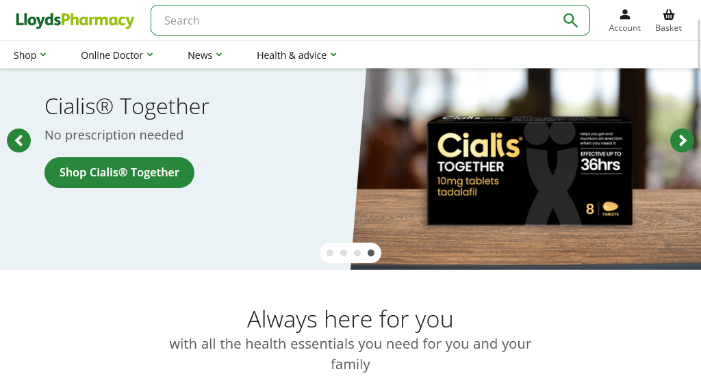
Website: https://lloydspharmacy.com/
The site has clear navigation menus for categories like Shop, Weight Loss, Men’s Health, Women’s Health, etc., helping users find what they need quickly. The dedicated Health & Advice section offers articles and advice on various health topics. This is integrated into the shopping experience, providing valuable information and guidance to users alongside product listings.
The website prominently features its Online Doctor service, offering online consultations, same-day prescriptions, and treatments for various conditions. The page includes promotional banners and offers that are designed to catch the user’s eye and encourage engagement with specific services or products.
Key design elements:
- Detailed navigation
- Clear categorisation of products
- Relevant content
- Responsive layout
7. Rx Outreach
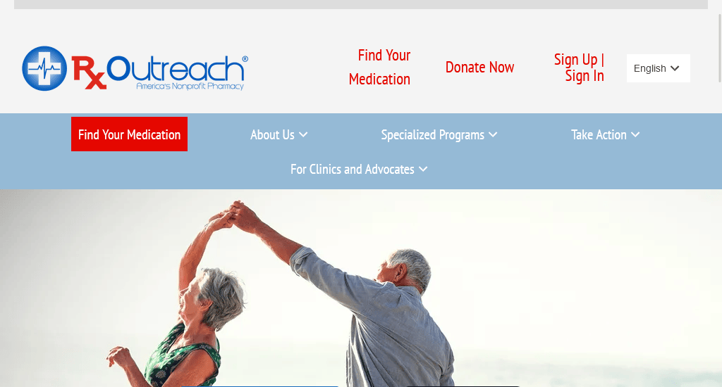
Website: https://rxoutreach.org/
The RXO logo is prominently displayed, reinforcing brand identity. The prominent announcement section cleverly highlights new features while drawing immediate attention to significant services or updates. CTAs, like Learn More, Find Your Medication, Enroll in Rx Outreach, and Transfer a Prescription, are thoughtfully placed to guide users.
Also, relevant images such as happy couples, mission iconography, and stamps of approval like the BBB, NABP, and Candid Seal boost visual appeal and credibility. The display of recognitions from Forbes and Money Online Magazine adds more legitimacy.
Key design elements:
- Prominent announcement banner
- Straightforward navigation menu
- Visual and informational hierarchy
- Engaging CTAs
Conclusion
So, it’s high time to start your digital journey today. When considering the development of your pharmaceutical website, you can try incorporating the key design features we have outlined in this article.
However, if you lack the expertise to build such a website independently or just want to skip the complexities of building a website, there’s no need to worry. You can always opt to outsource the task to professional website agencies or designers with extensive website development experience.
You read a lot. We like that
Want to take your online business to the next level? Get the tips and insights that matter.