Web Design Trends You Need to Follow in 2015
In the world of design, trends tend to change rapidly and unexpectedly, with new exciting technology and developments giving life to people’s wildest ideas. This year is no different as designers and developers continue to refine and perfect web design.
Related Article: 10 Web Design Trends for 2019
Already this year we’ve seen the minimalist design trend becoming a major feature of many sites. Here are a couple of the biggest web design trends of 2015:
Large images
The number one feature we are seeing this year is the use of large feature images. From photographs of people and landscapes to big panels of custom graphics, designers are focusing on high-quality images that produce a vivid, cinematic feel.
These kinds of images usually take up the entire screen and immediately set the atmosphere for the site. Often these graphics will play with the visual weight of the subject creating contrast with colour and symmetry.
Dramatic Typography
Typography is playing a huge part in the latest website designs. Big, bold type allows designers to play with on-screen negative space and the website’s visual hierarchy.
This is not simply about choosing the most suitable typeface to get the information across, but instead concentrating on the shapes and the feelings the type can dictate, focusing on the mood and atmosphere of a site.
With so many sites vying for our attention, a good strong statement can help you stand out from the crowd. Some sites make simple statements that sum themselves up and capture their intended audience. Using typography in a creative way can be especially powerful as it questions the user’s predefined notion of how text is generally used.
Streamlined
User Experience is king in the very latest website design trends. Web designers are minimising the amount of thinking the user has to do by streamlining every element of the site so users don’t have to consciously think about how to get from one page to the next.
This is done by simplifying navigation – making menus big and easy to read and click on, making it simple for customers to get from one end of a sale to the other without having to fill in lots of forms and splitting information up into manageable blocks.
Flat design
Flat design is a minimalist style that has become more and more popular in recent years. Flat Design doesn’t actually mean completely flat, but rather the idea of paring down the concepts you wish to represent and illustrating the essence of the objects – this kind of design has taken over the older skeuomorphic style where designers try to imitate physical objects as close as possible (textures, colours and perspective).
Flat design has become increasingly popular because it looks great with both large and small sizes and large blocks of fun, the vibrant colour looks particularly great on high-resolution screens.
Parallax
Parallax is a distinct visual effect that has recently become very popular in modern web design. Many sites now feature parallax scrolling to create the sense of distance and depth within a page or site. The code uses dynamic background and foreground elements to give a layered effect and make the site appear three dimensional.
Visual elements may magically appear as you scroll down giving the viewer added interactivity and the feeling of discovering something new. This idea of layering to add depth has been used in video games for a number of years, imitating a multiplane camera and making the viewer feel like they are a part of the environment.
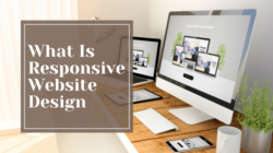
Responsive
Possibly the biggest trend of 2015 that is definitely here to stay. We’ve already written a lot about responsive website design because of how important it has become to SEO and how important it will be in the future.
Every day more and more people are using smartphones and tablets to access websites rather than sitting down at tables and looking at desktop computers, this has given rise to the mobile first approach website design. It is now very important to consider how a site will look on all different screen sizes and make sure it is has a fully optimised user experience whether big or small.
Throughout all these big trends we can see a common thread – whether it’s a responsive modular design, speed and loading times, using big pictures, video and interesting, compelling text, website design are now firmly focused on how the user experiences and interacts with the site.
Websites are no longer about simply getting information across or selling a product, the really good ones are an immersive experience that is so easy to use and navigate, you forget there is someone behind the scene coding and designing it all.
You read a lot. We like that
Want to take your online business to the next level? Get the tips and insights that matter.