Top 14 Financial Service Website Designs in 2023
When it comes to comparing online services, we tend to make our judgements based on the content and overall design of the site. Ensuring a clear and user-friendly design when promoting your financial service website is what leads potential clients to choose your products over competitors.
That’s why it’s essential for your overall design to both look and feel as if customers have come to the right place. We’ve put together our top financial service websites if you’re stuck on where to begin.
However, first, here are a few key elements your new website must have:
- Welcoming homepage with appropriate images and videos.
- A clean and responsive design that’s structured for easy navigation.
- Visible call to action buttons.
- A unique logo for website branding and identity.
- Rate management calculator.
- Online account opening and access to financial forms.
- Links to social account.
- An about us page.
- Backend should be easily manageable.
A well-thought-out design relies on clear, straightforward information and how you present it. For example, using a visual hierarchy to highlight content, such as a free quote or contact numbers, lets users know you’ve put their needs to the forefront, giving your site a better feel.
To demonstrate how sites execute their design decisions, 14 financial service websites utilise the qualities mentioned above.
1. SGUA
Website: https://www.sgua.com.au
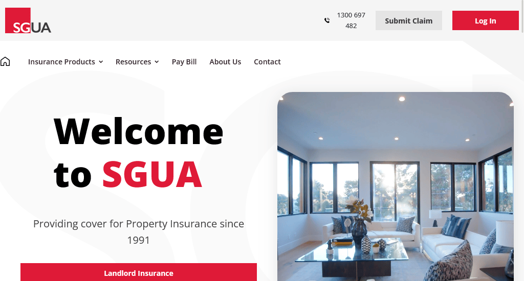
SGUA offers landlords the best-valued insurance for residential properties.
What makes their site a favourite:
- Use of well-placed call-to-action buttons throughout the site.
- The mixture of black and white with an accent colour gives off a clean, sharp and assertive feel.
- Their quote request form takes you through a multi-step process, which is a good strategy for generating more leads.
- Features like Landlord Insurance and Holiday Property Protection are visible on their website, while forms or statements are well-labelled and easy to access.
- It is made responsive for mobile view, with the navigation bar cleverly tucked under a hamburger menu.
2. CAPITEC
Website: https://www.capitecbank.co.za/
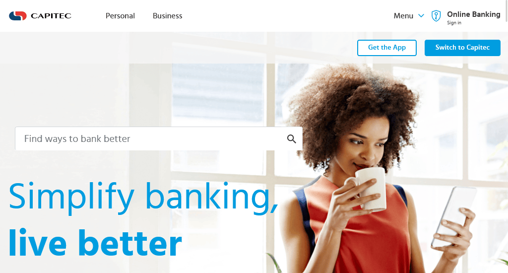
Capitec Bank Limited aims to create a better financial life for its customers, improving their living standards.
What makes their site unique:
- A new twist on the old navigation bar! It includes a search bar to make it easier for visitors to bank better.
- Online banking is placed at the top of the site, making it highly visible and accessible.
- Packed with different call-to-action (CTA) buttons.
- The site is very neat and uncluttered. The landing page only contains information the users are interested in. Every piece of info a client wouldn’t need at a glance is tucked away in a separate tag, so users don’t have to scroll to find what they’re looking for.
- The white background gives it a professional and minimalistic look. The background also puts the CTAs in stark contrast, enhancing their visibility.
3. CANSTAR
Website: https://www.canstar.com.au/
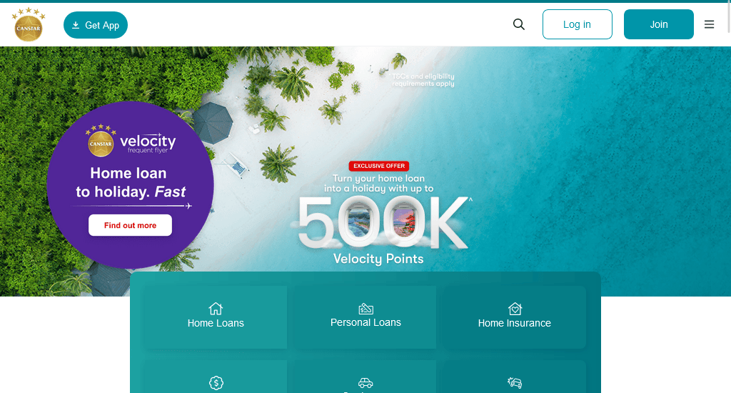
Established 31 years ago, Canstar is Australia’s biggest financial comparison site. With experts able to review over 4,000 home loan options for you to compare.
What makes their site unique:
- The use of white spaces and the contrasting blue makes all information easy to spot.
- The navigation bar drops down when moused over, removing unnecessary user interaction.
- Comparing Home Loans on their Landing page gives you the current rates and the monthly repayment amounts. To easily find what loan is the best fit, the site can filter through loan types, features and lenders.
- Finance calculators from loans to income tax, savings to credit cards are available on-site and easy to access.
- Animations are minimalistic but still work to enhance users while keeping the site professional.
- The use of blue on their website is easy on the eyes and is said to promote trust in users.
4. InfoChoice
Website: https://www.infochoice.com.au/
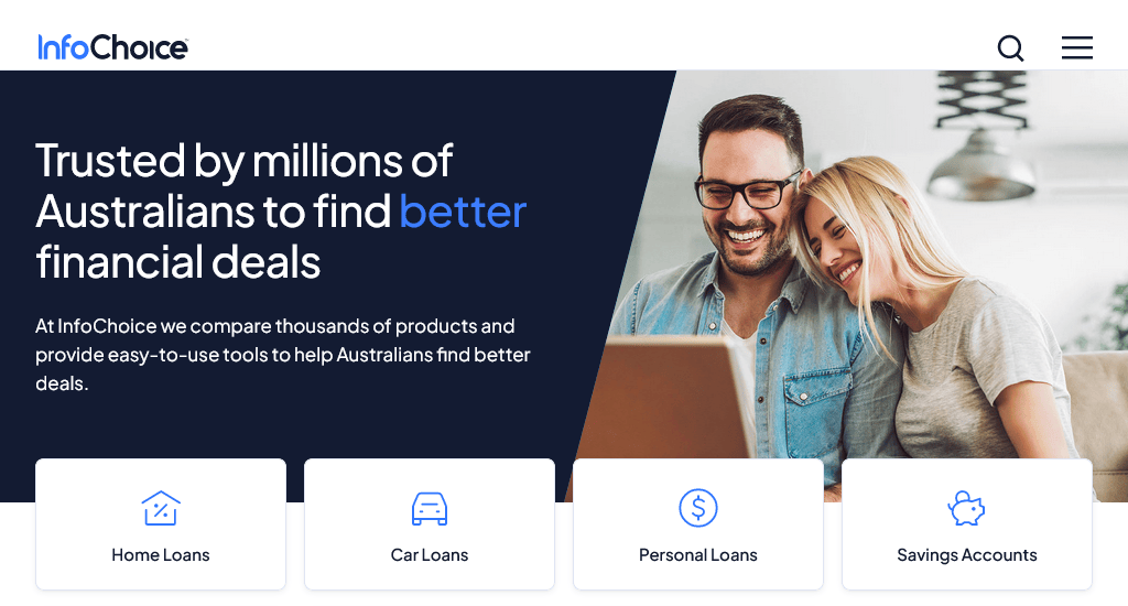
Using InfoChoice, you can compare different types of loans, credit cards and many other significant financial services until you find the one that best suits your lifestyle.
What makes their site unique:
- When hovered over, the buttons change from light blue to darker. A sound design choice as it draws focus to the selected option while keeping the user’s attention.
- A whole range of calculators, including car loans, credit cards, mortgages, income tax and home loans, are available.
- Daily special offers and news are displayed on the home page.
- As a visitor, you can even book to schedule a call with an expert Aussie Mortgage Broker.
5. Commonwealth Bank of Australia
Website: https://www.commbank.com.au/
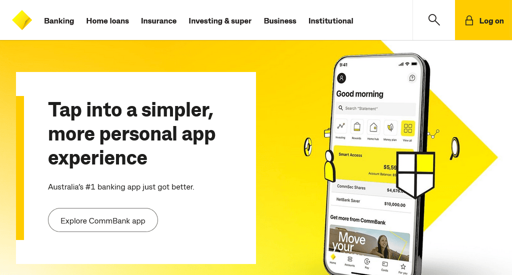
The Commonwealth Bank of Australia is one of the leading providers of integrated financial services, providing a wide range of services, including financial planning, travel products and business products.
What makes their site unique:
- Their colour palette includes only three colours: black, white and yellow. The palette gives the site a streamlined feel and memorable branding.
- Their regular services are all in the top navigation bar, making them easily accessible.
- By scrolling down, visitors will see products that are presented to users as large buttons that effortlessly draw attention.
- The list of social contributions also helps form a more positive relationship with visitors.
- The link to download their app is available on the website. It is a huge time saver.
- A client can easily create his/her budget with the help of the various tools and calculators available on-site.
6. Credit Karma
Websites: https://www.creditkarma.com/
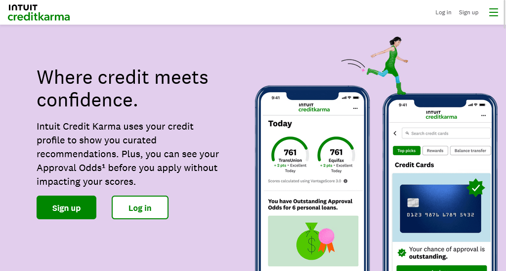
With Credit Karma, not only can you overlook and compare on the services that impact your credit score, but you can also request a free and easy credit score rating. Additionally, you’ll receive monitoring and insight to assist in improving your score.
What makes their site unique:
- This website achieves its stylish design by using simple colours like black, white and grey, only to accent them with images and buttons using bold primary colours. The use of primary colours stops the site from feeling boring and gives a distinctive feel.
- Tools like free credit score ratings, debt repayment calculator, simple loan calculator and amortisation calculator are highlighted and available for customer’s use.
- Menus drop down from tabs in the navigation bar upon hover.
- Large font CTA buttons with bright colour backgrounds have been placed at the top of the page and repeated at the end of the page in inverted colours to gain maximum user attention.
- Links to the app on both the App Store and Google Play, making it easily downloadable.
- Their extensive security and privacy. This step should never be overlooked as a financial service provider as it can often sway and assure unsure visitors.
7. ANZ International Banking
Website: https://www.anz.com.au/personal/travel-international/
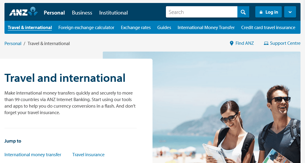
ANZ International Banking is a must for anyone looking to travel or live internationally. It allows bank account set up from overseas along with a whole host of over services, all ready to go before you arrive.
What makes their site unique:
- Allows you to create your bank account online and transfer funds overseas.
- Includes features like foreign exchange calculator, exchange rates and international money transfer.
- Products and Tools are can easily found by users as they are grouped into two separate components. This design choice appeals to the part of our brain that likes to find patterns and group things.
- The page is designed, so that products are shown first, with any relevant offers displayed to entice customers looking to travel.
- A client can easily download their app for mobile use. The social media links are at the left bottom of the page as per the current trend.
8. AIA
Website: http://www.aia.com.au/
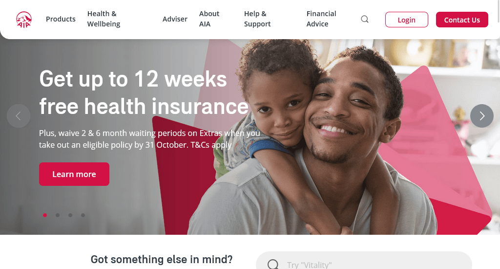
AIA aims to provide you with financial security, through the protection of income and assistance when it comes to business expenses. They also assist in developing healthy workplace environments, and personal plans tailor-made for different life stages.
What makes their site unique:
- Images used in the hero banners are modern and on trend with what visitors expect to see. They also correspond to each service or key moment without being overly literal.
- Products and their corresponding descriptions are designed as clickable icons, making the clickable area larger and interaction easier.
- Drop down menu expands into a mega-panel. The menu allows for grouping related topics and images added as visual cues.
9. Vouch
Website: https://www.vouch.us/

Vouch works on a mission to empower individuals to courageously embrace significant challenges, venture into uncharted territory, and revolutionise their respective industries. It offers a full-service & technology-driven insurance solution.
What makes their site unique:
- The heading on the hero section is simple and utilises a large font, while a short paragraph is used as a subheading. The picture of a working woman as a backdrop speaks of trust.
- Below the hero section, it opens with a responsive video that presents the words of the experts of Vouch as well as the work environment.
- The website has a clean design with a very limited colour palette.
- Visitors can easily access a support chatbot located at the bottom of the screen that doesn’t disrupt your browsing experience by automatically popping up.
10. PayPal Australia
Website: https://www.paypal.com/au/home
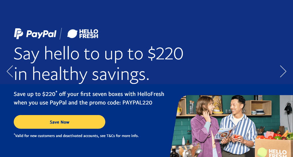
PayPal Australia aims to make transferring money simple. Whether it’s among friends and family, or online stores, PayPal provides secure checkout and transfers without the hassle of continuously putting in your card or bank details. PayPal also guarantees the safety of purchase, offering a refund policy for any scams of fraudulent accounts.
What makes their site unique:
- Visible CTA buttons.
- Proper use of ghost buttons, creating a flow where the CTA is what the viewer sees first.
- Provides a simple yet informative graphics demonstrating how PayPal works — giving visitors necessary info engagingly and reliably.
- The site gives separate links to it’s Android and iOS apps for enhanced usability of their website.
- The mega drop-down menu is hovered over to trigger so that it’s more intuitive for the user.
Related article: Top 5 PayPal Alternatives for Online Businesses in Australia
11. SoFi
Website: https://www.sofi.com/
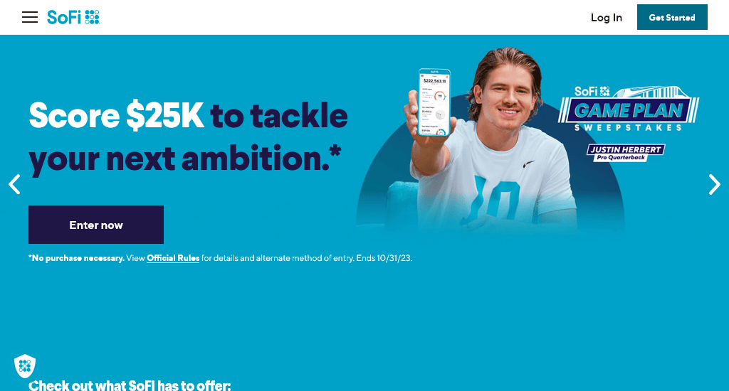
SoFi is a company set on helping those with your student, personal and home loans. Additionally, they also provide money and investment services.
What makes their site unique:
- Sticky navigation bar where their different services and products are always in view.
- Opting for a video for their hero section is a bold choice that works seamlessly with their forward-thinking ideas. The themes of academic and financial success and relief in the feature section gives users the sense of both the sites goodwill and innovation.
- Clicking the CTA at the bottom of the page triggers their product page to open in the existing window instead of a separate one, allowing users to click out and return to the home page easily.
- Key figures, including members, referrals and repayments present on the site act as social proof to enhance the reliability of the services provided while their appearance on a vivid coloured background boosts their visibility.
- Benefits enjoyed by members are made focal through relevant images, showing off the entitlements rather than relying on much text.
- Links to their app for Android and iOS platform as well as social pages are bundled together at the bottom right where visitors through experience will expect them to be.
12. Westpac Banking Corporation
Website: https://www.westpac.com.au/
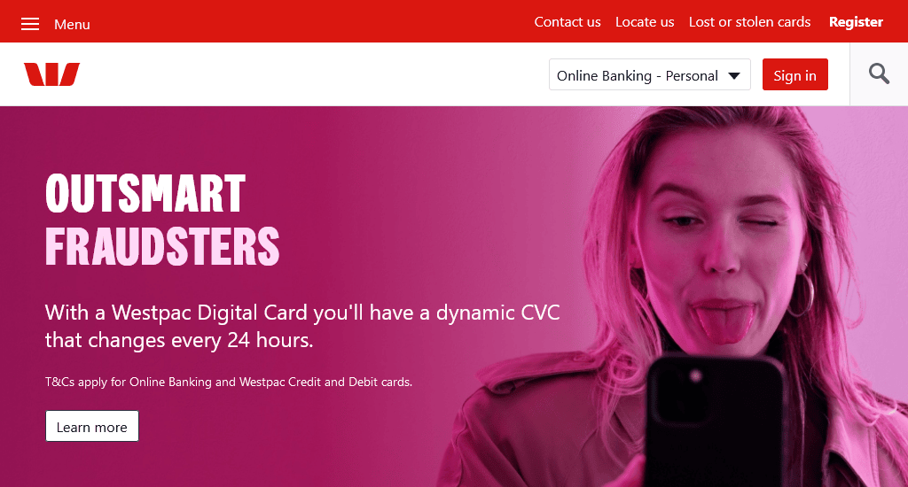
As the oldest banking institutions in Australia, Westpac is well recognised for its outstanding financial services. Managing over 14 million customers, the company maintains its reputation being awarded the most sustainable global bank four times in a row through the Dow Jones Sustainability Index.
What makes their site unique:
- The hero section comes with a bright pink colour design that separates itself from the rest of the page while drawing attention to the content and Learn More CTA.
- Important products and services are found below the hero image, removing the need to scroll below the break.
- Separate segments are dedicated for personal and business use, defined using two different shades of grey.
- With the site structured horizontally, their real-time exchanges rates can be located at a glance.
- The navigation bar is sticky, with buttons for personal, business and corporate applications so that visitors don’t have to search for the information their looking for.
- Social Media links are showcased at the bottom like most conventional sites.
13. Bendigo Bank
Website: https://www.bendigobank.com.au/
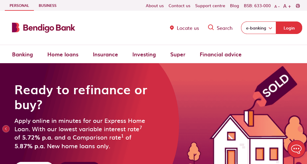
Originally started to help fellow Australians build their own homes, Bendigo Bank is now recognised as one of the major banks in Australia. The company acknowledges its role and responsibilities when it comes to their customers and their environment, even promoting their eco-friendly “green loan”.
What makes their site unique:
- The sliding hero image shows off the banks’ benefits, prompting visitors to find out more on each. Not only does the animation garner the attention of viewers, but it also helps establish reliability at a glance.
- The navigation bar is hovered sensitive, with each drop-down menu being contrasting shades of grey, defining subsections from the main information or services.
- Both the Law of similarity and rule of thirds is employed under the hero images. These rules improve the usability of the site as well as the overall design.
- A visible and large help section for users to see and access easily.
- Additional information appears when clicked, opening up on the same page.
- The sitemap is broken into categories making navigation of topics easy for customers.
14. Betterment
Website: https://www.betterment.com/
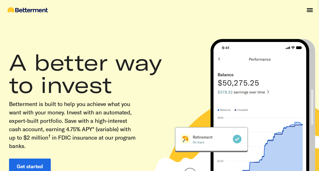
Betterment is an online financial advisor, with their platform designed for anyone looking to invest. Their goal is very simple: to deliver better investment for those who won’t settle for anything less.
What makes their site unique:
- A clean, strong and assertive look is through the combination of the pastel colour palette that showcase a minimalist look.
- A video is used to inform users on their services.
- Visible app links.
- An onsite tool that gives its users instant investment advice based just on age and annual income. The different investment plans are colour-coded and detailed, providing names of companies money should be invested in.
Once again, it’s vital that your website is both highly usable and engaging, but the job doesn’t just stop there. Maintaining your site requires a good understanding of peoples’ expectations and frustration as well as adaptability. Furthermore, with the increasing threat of data leaks, cybersecurity needs to be regularly updated.
When talking to your designers, keep our key points in mind, to create a website that visitors will continue to return to.
You read a lot. We like that
Want to take your online business to the next level? Get the tips and insights that matter.

