
A Simple Guide to eCommerce Website – Plan Things before You Move!
When beginning to build an ecommerce site, you will be faced with many choices regarding the design and the functionality of your site. Taking the leap into the online shopping world is a big decision, and careful planning and strategy is the only sure way to set yourself up for success.
Introducing ecommerce
When you think about how much time and money is spent planning and outfitting physical retail stores, you can begin to understand how important it is to thoroughly think through the appearance and flow of your ecommerce shop.
Big retailers like Aesop and Apple have spent millions of dollars researching, creating and maintaining their look, focusing on the psychology of their customers. While not many businesses have this kind of cash, a little bit of planning can go a long way when it comes to capturing your audience.
To encourage people to buy from you, there are certain impressions you must make. You must appear trustworthy, so people are happy to hand over their payment details and so you must be transparent and professional. You should always include contact information and privacy, returns and shipping policies. Testimonials are also a good way to build trust amongst your prospective clientele.
One of the most essential characteristics of an e-commerce shop is its ease of use. Customers are in your store to buy things, so make it as simple as possible for them to get through the purchasing process.
Ensure that your site is fully mobile responsive so your menus, products and shopping cart are easy to find and click on no matter what kind of device your site is being visited on. Offer a number of different payment methods so you don’t lose people right at the end of the purchasing process.
Determine the Number of Products You Will Sell
This will dictate how many pages your site will have and how it is laid out. If you are selling just one product you may be considering creating a single page site, but if you have more, you will need a comprehensive plan as to how you arrange and categorise them so they’re easy to find and purchase. If you have hundreds of products, it’s worth considering a search function that includes the ability to narrow searches by applying exclusions.
A good example of this is ASOS who have hundreds of products and a very comprehensive system to guide their customers to what they’re looking for – categories and subcategories give users the ability to narrow their search while still being exposed to lots of options.
Consider the Look and Feel
Along with deciding on a name for your brand and website, you may also have established a visual language that separates you from the crowd. If you already have a visual identity in place you will naturally need your site to echo that same look.
For example, if your logo, promotional materials and/or brick and mortar shop is modern and clean, you will need a clean, modern site to reflect that too. This should extend to your navigation, layout and even your product pictures. Deciding on these elements and communicating them to your ecommerce web designers will ensure there are no clashes later that could consume both your time and money.
Provide Good Visual Content
Product pages should be designed with the sole purpose of showing off the product and enticing a purchase. Give a range of large, high-quality pictures giving several different angles of the product and include the ability to zoom for extra detail.
Some sites like Outlier even feature gifs and videos of the products in action. If you’re selling virtual product videos of its functionality can be particularly useful.
Lotuff Leather features product photos that give the impression of being able to actually feel the texture of their leather accessories. They have a number of high-quality photos of the product providing different perspectives and showing details as well as including a photograph that gives an idea of its size.
Related article: How To Use Visuals In Ecommerce
Suggest Related Products
You may have noticed that many very successful eCommerce sites have this particular element in common – after the information and photo of the product you are looking at, you will see some suggestions for similar products you may be interested in.
People very rarely come on to an ecommerce site to just make a single purchase and this technique gives them further opportunity to consider other products that complement the one they are purchasing.
Aesop has a feature right below the main product details suggesting which products work best with your current selection. The simple layout allows for a small amount of text suggesting how you should use the products in conjunction with each other.
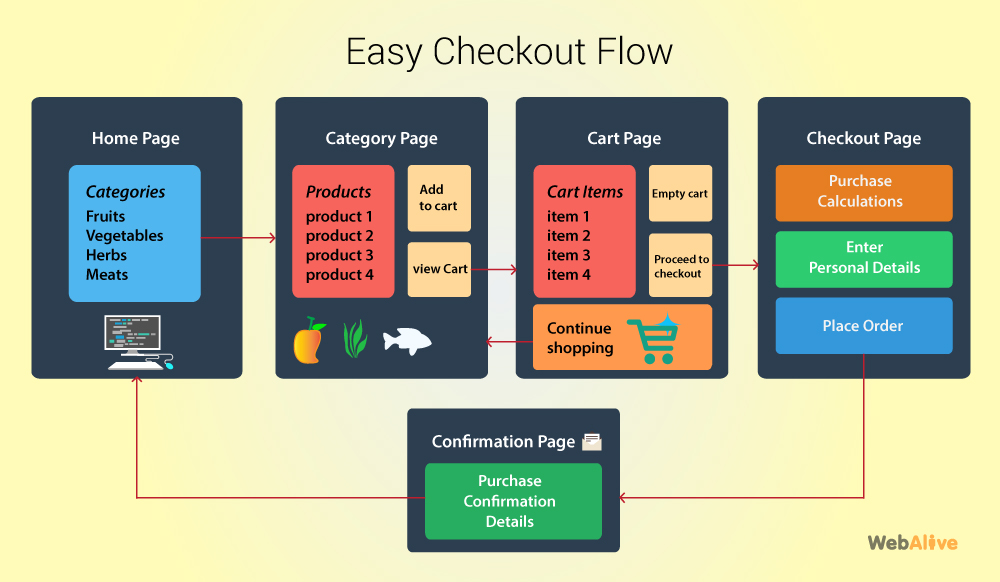
Make Checkout as Simple as Possible
Complex check out processes lead to more customers abandoning their carts before payment. Try and keep the entire process as streamlined as possible. Make sure to include a page where customers can review their order but leave out extra confirmation pages and only ask for the information you need.
When checking out, presenting people with long forms they have to fill out, an extra page getting people to sign up for an account and restrictive payment methods will further complicate the process and should be avoided.
Include Detailed Descriptions
Your customer wants to know everything about the product you are selling to them before they decide to purchase, if they can’t hold it in their hands and determine the physical quality, giving them a complete description of the item is the next best thing. Include measurements, details and specifications.
A bad description (or no description at all) not only fails to give any information, it looks lazy and unfinished. Make sure your page design can feature at least one paragraph on the product pages.
UrbanOutfitters has several hundred products but that doesn’t stop them from providing detailed descriptions of each one. Not only do they give a full idea of the product and its features, they also include its dimensions and care instructions.
Map Out Your ‘Sales Funnel’
Consider how you will direct your customers from one part of your site to the next. Determining how your sales funnel will work depends on the kind of products you’re selling and the price you’re selling them at.
Provide easy click-through options and a logical path from the product page to check out and map the way you would like people to proceed through your home page, search results page, product pages and then through the checkout process.

Include Lots of Calls to Action
Possibly the most important element of an ecommerce site – calls to action are indispensable. E-commerce websites with more than one product should have called to action on each product page – ‘buy it now’ ‘add to cart’ ‘add to wishlist’ and ‘keep shopping’ are just a few of the most common.
It’s important not to overwhelm the purchaser with too many choices, these calls to action should be clear and easy to click but should not eclipse the product information.
If you’re considering building an eCommerce website but have no idea where to start, or you’re not sure which of these features you should add to your site, WebAlive is here to help. We offer custom eCommerce solutions, fantastic responsive web design and have experts on hand to help you determine the best strategy for success. Contact us today to find out more.
You read a lot. We like that
Want to take your online business to the next level? Get the tips and insights that matter.