
5 Design and Development Updates That Failed To Impress Users
Design styles and tastes naturally change and evolve over time, whether we’re talking about clothing, architecture or online design. It’s just human nature to adapt things and to want to keep up with and develop new trends.
If you take a look at the history of website design over the past few years, it’s clear that this is the case in the online world. Most updates are welcome and necessary; a fresh new look to a logo, website or operating system can be exciting.
But some updates aren’t met with as much enthusiasm as others and can actually be quite frustrating to users if they take a step backwards and make things more difficult than they need to be.
This article will look at a few examples where companies’ design and development changes have been met with criticism in recent years.
Apple iOS 10
The recent update to Apple iOS was launched just last month and has been described as a big change to 2015’s iOS 9. Given that Apple decided to take things in a new direction stylistically, there were always going to be some users that took a while to get on board.
But the negative press the update has received since its release indicates perhaps there’s more to it than just a reluctance to change on the part of Apple customers. Comments from users across social media sites indicate that perhaps it’s not worth updating at all if you haven’t already.
Apple Music, which enables user to listen to music on their devices, has taken the brunt of the criticism, as users claim that the new layout makes it more difficult to browse through the library, easier to accidentally hit the wrong tab and buy music that you’re not interested in, and ultimately has an uglier, more archaic design.
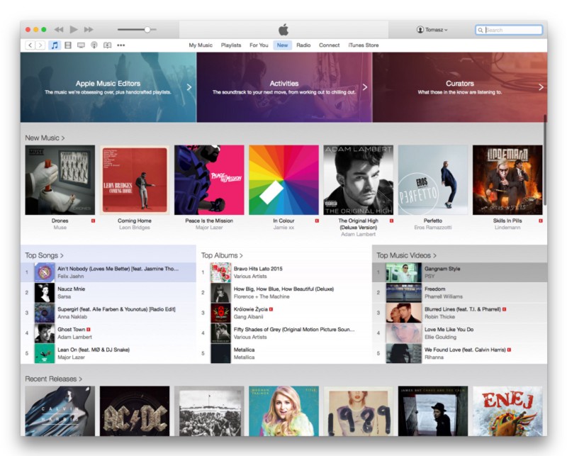
Further, iOS 10’s larger notifications on the lock screen have not been well received, partly because they look more like those of Android devices. Apple also chose to do away with the slide-to-unlock feature, now requiring that users press the home button to bring up the passcode screen or Touch ID.
While this is changed in Settings, this has brought a lot of frustration given that lifelong iPhone users are used to the slide-to-unlock feature and ultimately there doesn’t seem to have been any reason to change it.
To add to the frustration, the update caused problems and ‘bricked’ a number of iPhones and iPads. Millions of users reported a reboot loop, which essentially made their devices unusable. While Apple fixed the issue, this was met with a great deal of criticism and didn’t do Apple’s image any favours.
Related article: 9 Signs Your Website Might Need a Redesign
NBA.com
Large sporting websites can be difficult to get right. New information is added daily to what is already a huge amount of content, so there are many different pieces of the puzzle that need to fit together nicely.
Typically, home pages of major sporting leagues will need to give a snapshot of game results, what’s happening news-wise, images and links to articles and/or opinion pieces, forums and discussion boards and more.
Users come to these websites for a variety of reasons and need to be able to quickly access what they’re after, so featuring as much visible and clickable information as possible without cluttering up the page make sense, and is the strategy that most major sporting websites have adopted.
Early this year, NBA.com decided to go in another direction, choosing to strip down their website in a way that made it more smartphone/tablet orientated.
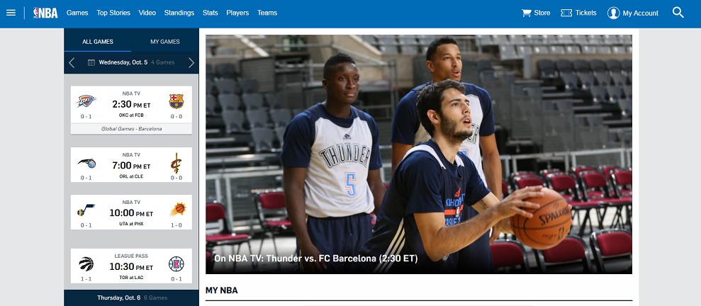
In the process, they did away with a lot of information, hiding it in menus and making it slightly more cumbersome to find.
Unfortunately, this was met with strong opposition just this month, when a multitude of basketball fans on Reddit came out and pointed out the updated website’s flaws, with users making many comments including how the NBA’s development team “needs to stop trying to reinvent the digital wheel” and that, for users, ‘trying to read a box score is like pulling teeth’.
The issues were so pronounced that 4x NBA MVP Lebron James took to Twitter to call out the developers on their website’s shortcomings, which made it difficult to sort through statistics and results.
@nba GameTime App 2016-2017 can we please fix the box score portion. It’s to challenging scrolling through it and remembering previous stats
— LeBron James (@KingJames) October 7, 2016
Needless to say, these problems were resolved quick smart after such an important NBA personality got involved and brought up the issue.
London 2012 Olympics
While this wasn’t technically a redesign, any list that includes highly criticised designs needs to include the logo for the 2012 London Olympics.
![]()
Causing what can be described as an uproar when it was released in 2010, the logo was criticised for – among other things – trying to look edgy and ultimately failing miserably.
While presumably going for a modern, fun aesthetic, people complained that the logo looked like something from the 80s or 90s, while failing to really convey anything about the host country’s culture, which is something Olympic logos strive for.
To add to the controversy, there were suggestions made that the logo spelled out the word ‘Zion’, which is a reference to the religious concept of heaven. Iran even threatened to boycott the Olympics as a result.
Probably most importantly, the logo was criticised simply because it was said to be an unappealing design and didn’t measure up to the quality of other Olympic Games logos.
But it wasn’t just the logo that caused drama, there were also major problems with the London Olympics ticket resale website, which crashed on multiple occasions and left prospective sellers and buyers furious.
Windows 8
Windows 8 was another major operating system update that brought mixed feedback from users.
Looking to create a modern operating system that catered to a market that was fascinated with touch-computing, hindsight suggests that Microsoft may have taken it too far.
Critics of the update pointed out that while the design and usability changes worked well on smartphones and tablets, they didn’t necessarily translate across to desktops and often made things frustrating and difficult.
Indeed, the Start screen did mimic what we see on phones and tablets design wise and was somewhat confusing to operate at times. This was made all the more obvious by the fact that it replaced the classic Windows Start Menu, which saw programs pop up neatly from the bottom left of the screen – a beloved feature for many years.
Criticism was also aimed at the fact that many features were stripped away and using Windows 8 required that you sign up for a Microsoft Account, which was seen as a transparent attempt by the company to get users in a situation where they were relying on their services.
Related article: SEO Checklist for Web Redesign: How to Avoid Losing Traffic
Digg
Before one of the most widely publicised website redesign failures of all time, Digg was the world’s most highly-trafficked social bookmarking site.
In 2010, Facebook and Twitter were hugely successful and inspired countless other websites to change how they were doing things. Digg was just one of the many that may have gotten a bit carried away in the process.
Keen to ensure that they remained relevant, Digg redesigned their website and essentially the logic by which it functioned, making the service more focused on social networking. They wanted to add more social networking elements to what was then a functioning social bookmarking website.
Where previously, interesting posts and links that were running hot on the website would appear at the top according to the votes of the wider Digg community (or a select few), the change would mean that a user would instead see what their friends were sharing and looking at.
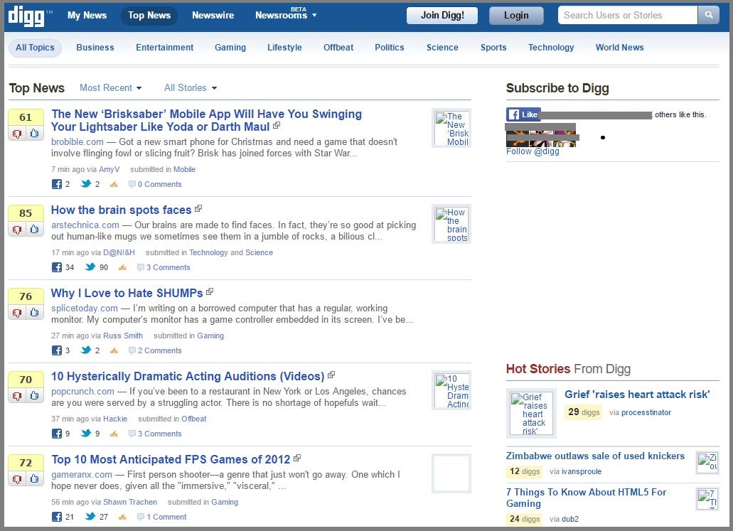 But given that Digg users weren’t using the platform to interact with friends – and thus often didn’t have large or even genuine friends lists like they would have had on Facebook – the links that appeared for most users weren’t those that anybody really wanted to see; they weren’t the best that the site had to offer.
This alone lead to a drop of around 25% in the number of users on the website, and Digg never truly recovered.
These are just a few of the biggest and most widely documented design and layout changes that caused controversy from big companies, but there are countless other examples of small and medium-sized businesses redesigning their websites and having negative feedback and/or a drop in conversions.
Sometimes it’s difficult to ascertain how successful a redesign has been, that why it’s always important to monitor changes in the behaviour of visitors to the website. Owning and managing a website is a constant, ongoing process so it’s important to get direct feedback from your client base as well!
If you’re looking to redesign your website the right way, or you’re simply some information, contact the team at WebAlive today.
You read a lot. We like that
Want to take your online business to the next level? Get the tips and insights that matter.