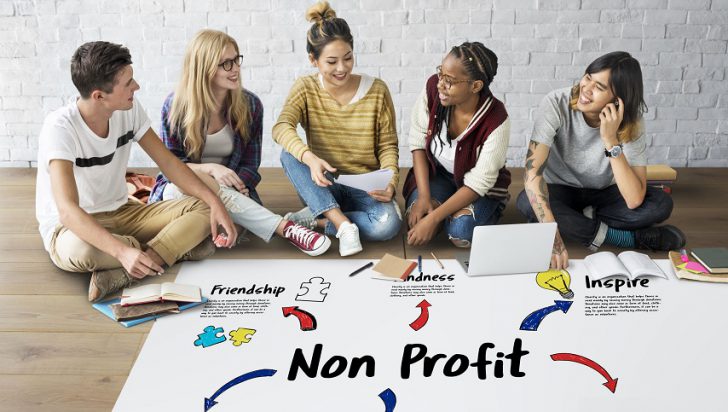
15 Excellent Examples of Nonprofit Website Design in 2025
Nonprofit websites don’t aim to sell products or services to their visitors, but they still need to convince people to support their cause. Websites are one of the primary ways charity organisations connect with their potential patrons.
A nonprofit website should serve five main purposes.
These are:
- Establish a good brand image
- Showcase their work and success stories
- Encourage donations and support
- Build a community and connect like-minded people
- Reach the group they aid
Nonprofit websites should be well-organised and easy to navigate. They also need to be visually appealing and have a feel-good vibe.
Based on these criteria, we have compiled a list of 15 of the best nonprofit website design examples.
1. Charity: water
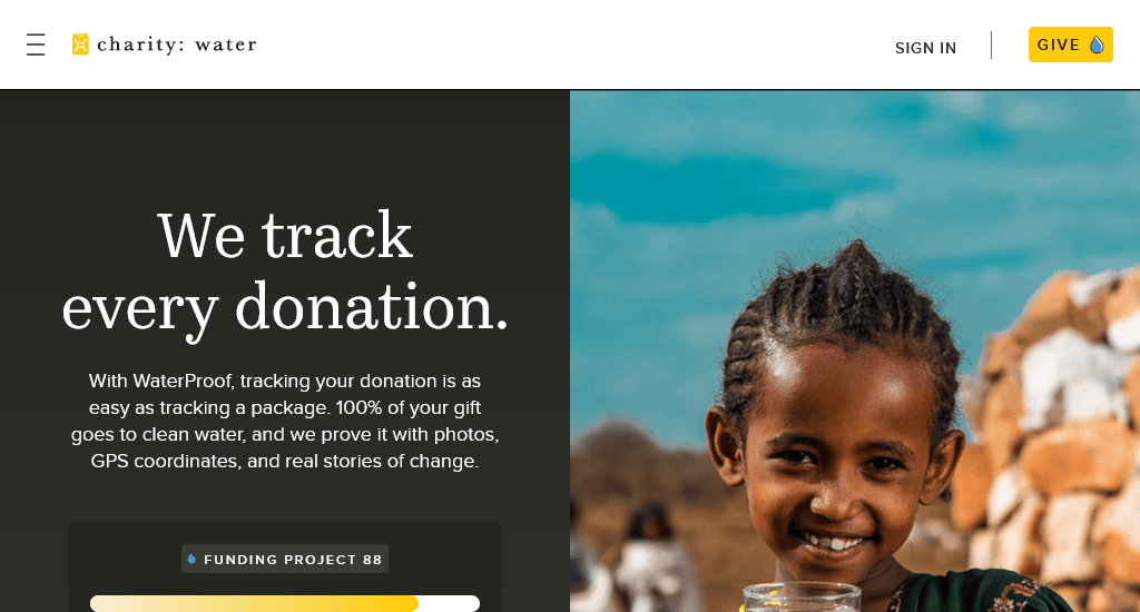
Charity: Water works to bring clean water to people in developing countries.
Why their site is excellent:
- The navigation bar sections – Why Water? Take action and About Us are perfect to let a new visitor find out more about them.
- The site features well-chosen headings and an organised footer section.
- With a mobile-friendly and responsive design, the site looks equally good on a small screen. The top bar still contains the Give Now button for a call to action.
- The donors can track their donations as well as receive photos, GPS coordinates, and updates that show exactly where their money is going.
- Each water project displays progress bars, funds raised, and the amount left to complete the goal. The use of this live progress tracking eventually creates urgency and a sense of shared community, as well as motivating donors to help finish the project.
- It uses high-quality photography to show the people and communities impacted by clean water projects. This helps in inspiring visitors as they can see faces and stories instead of abstract statistics alone.
Website: charitywater.org
2. Red Cross Australia

Red Cross AU is the Australian chapter of the prolific charity organisation.
Why their site is excellent:
- The top navigation bar comes with sections like About, Get Help, Act for Humanity, Ways to Donate, Stories, and Shop. Though the website offers extensive information, the design doesn’t overwhelm users as it breaks content into clear sections, using headings, and incorporating whitespace.
- Every page of the site looks neat and modern. The design and colour scheme are consistent across the site, which goes very well with the brand image of the Red Cross.
- The banner image shows a direct example of how the Red Cross is helping people and also encourages visitors to donate with a call-to-action button.
- The site works well on mobile devices. It retains the look and feel across different screen sizes. The sticky navigation bar stays in position as one scrolls.
Website: redcross.org.au
3. World Wildlife Fund
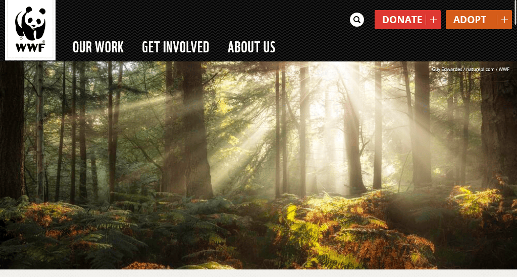
WWF works on wilderness preservation and the protection of the environment.
Why their site is excellent:
- WWF has a very informative website that aims to educate visitors about the current status of wildlife across the planet. The navigation bar includes Our work, Get Involved and About options. Hovering the mouse pointer on these headings brings out drop-down menus with well-organised sections.
- The Donate and Adopt call-to-action buttons at the top right corner take the visitor to a page with multiple donation options and information. This is a great way to convert potential participants.
- The rest of the homepage presents informative content from WWF. It blends images, text and social media content using a grid of rectangular boxes. The site looks great on a small screen. Overall, the design is visually appealing.
Website: worldwildlife.org
4. Habitat for Humanity
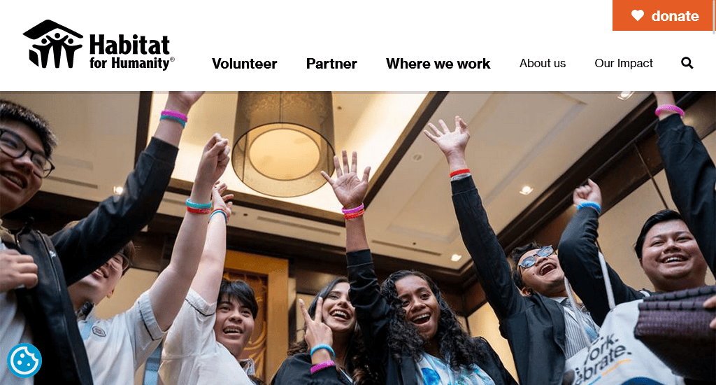
Habitat for Humanity provides housing for those who are in need.
Why their site is excellent:
- The homepage features real people in real settings, such as youth assemblies and volunteers in action, which build trust and emotional connection.
- The Donate button appears multiple times in different contexts, making it straightforward for users to act.
- As expected, the site renders nicely on mobile devices. Like the desktop site, it has a Load More button at the bottom of the News and Stories section instead of the infinite scrolling seen on some sites. Though infinite scrolling is a good thing for social media or ecommerce websites, users may find it annoying on a mobile platform.
Website: habitat.org
5. Feeding America
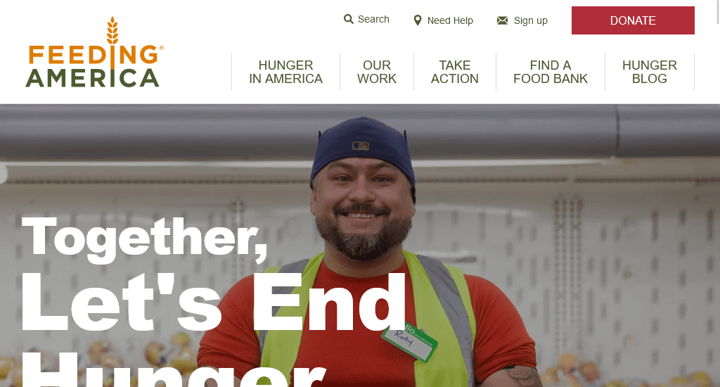
Feeding America is a hunger relief organisation that operates throughout the US.
Why their site is excellent:
- The homepage has a carousel of appealing images with an appropriate call-to-action. Each page of the website uses real-life photos to communicate the message of the organisation.
- Feeding America makes it very easy to find food banks or get help for those who are in need. The navigation bar sticks to the top as you scroll down the site. It has a Need Help button in addition to the usual Donate.
- The overall design of the site is neat and tidy. It’s completely mobile responsive.
Website: feedingamerica.org
6. Greenpeace Australia
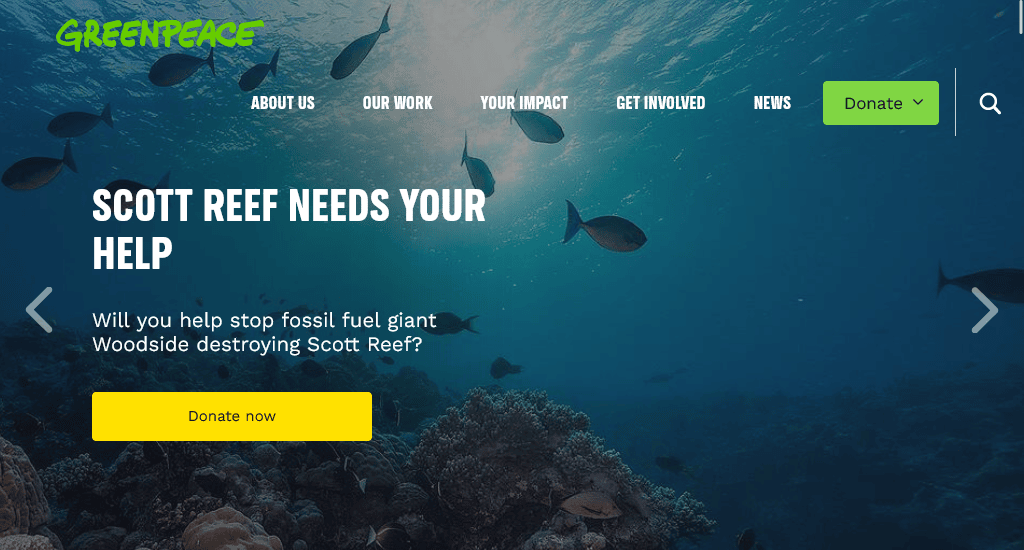
Greenpeace works for a green and peaceful future. They address environmental issues with protests and campaigns.
Why their site is excellent:
- The Greenpeace site is beautifully designed. They use a combination of images, whitespace, graphics and social media posts to make the website come alive.
- The website is action-focused. All of its call-to-action buttons, like “Sign Petition”, “Donate”, and “Join us”, dominate the page flow.
- It uses strong, emotional headlines such as “If they drill, expect a spill” or “Save the Ocean. Save our World” to create urgency and emotional pull and encourage visitors to act now rather than later.
- Unlike other non-profit sites, Greenpeace not just push donations but integrates petitions alongside donation asks. This lowers the barrier to entry—supporters as participants can join by signing campaigns instead of donating immediately.
Website: greenpeace.org.au
7. One Drop
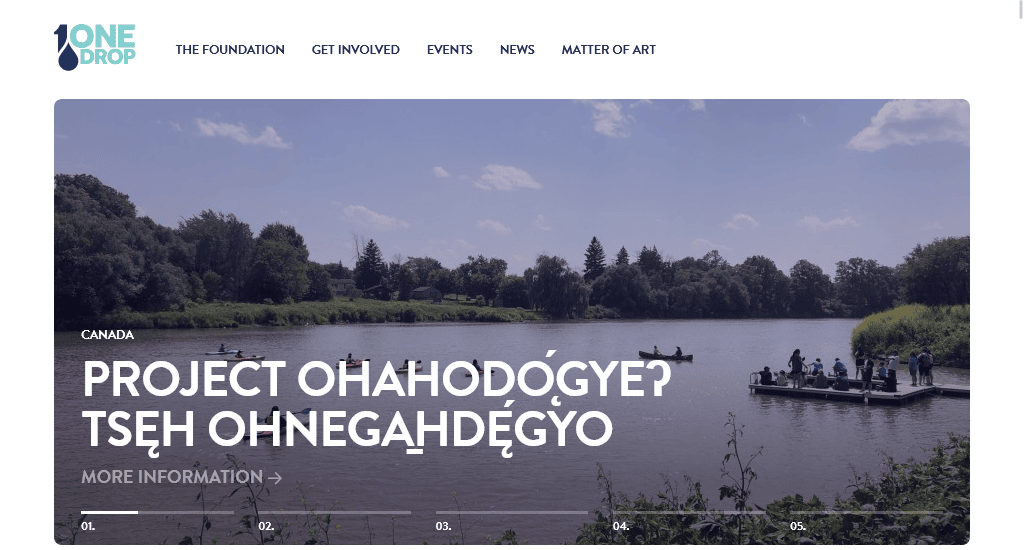
One Drop provides sustainable access to safe water to millions of people across the world.
Why their site is excellent:
- This charity website has a modern design with a beautiful colour scheme. The use of bold colours, the right combination of images, beautiful typography, and the use of real-life photos make this site stand out from other nonprofit organisation websites.
- One Drop’s website looks equally good on the small screen. It has interactive elements and smooth transition effects.
- Every project shows the location, status (ongoing/completed), and progress percentage (e.g., “Project Rajasthan 2 – 85% complete”). As it shows percentages, it makes the progress measurable.
- Visitors can see stories, past events, and project portfolios in a way that feels interactive and personal.
- There are sections like “Corporations and Foundations – Become a Partner”. It shows that the platform is built for both individual donors and institutional partners.
Website: onedrop.org
8. Rotary
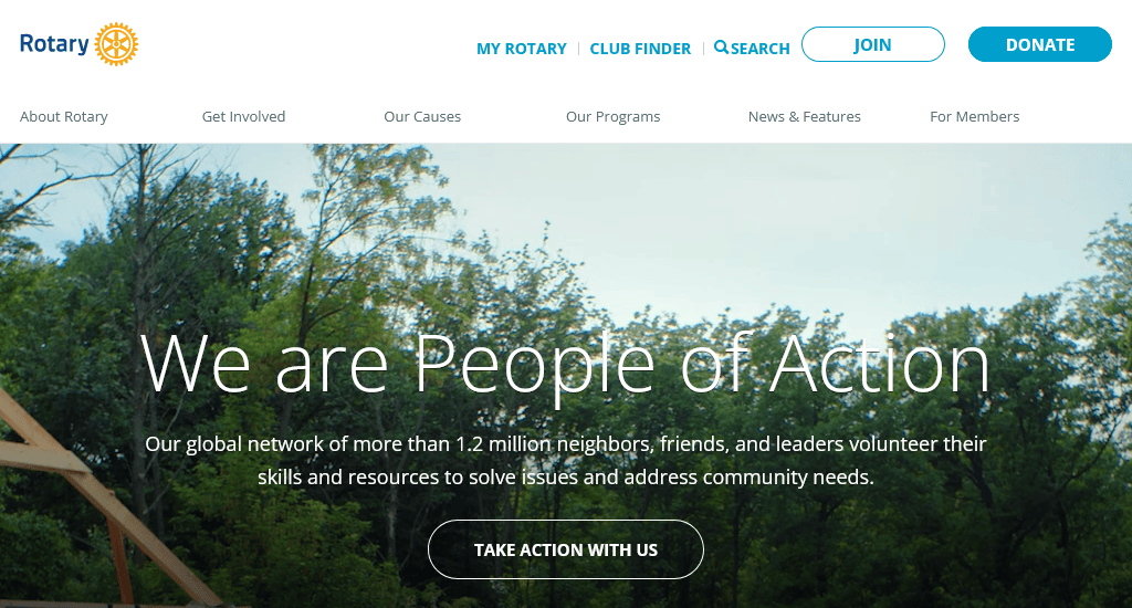
Rotary is a social organisation working across the world to create lasting changes.
Why their site is excellent:
- The site uses a video with multiple segments on the homepage, showcasing the Rotary people in action. Though auto-playing videos aren’t perfect for all sites, here they serve the purpose.
- The navigation bar of the site is well-organised. Hovering your mouse pointer on it brings out a detailed drop-down. There’s also a search bar and call-to-actions like Join and Donate.
- It uses phrases like “We are People of Action” and statistics to highlight the collective power of members. Large numbers such as 1.2 million members, $291 million awarded, and 47 million volunteer hours are prominently displayed to create instant credibility.
Website: rotary.org
9. Oxfam Australia
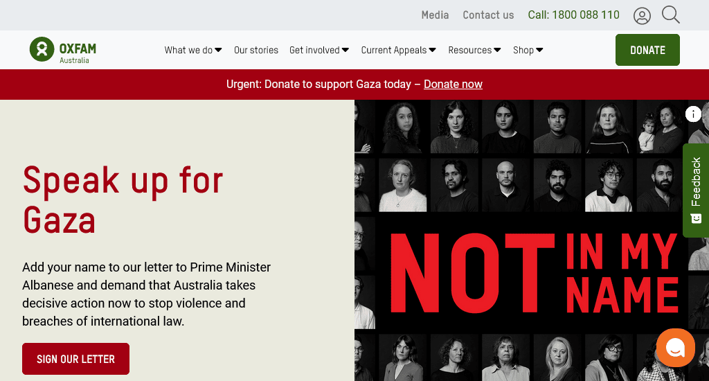
Oxfam is a well-known international organisation empowering communities and tackling poverty around the world.
Why their site is excellent:
- Oxfam is an excellent example of a standard nonprofit website. Their site is very organised, informative and contains several case studies. The choice of images with human faces and a green-focused colour palette helps them quickly connect with the visitors.
- The site makes it easy to donate and gives several donation options. Some of Oxfam’s project pages have intriguing designs taking advantage of full-page images, animations and transition effects. These pages help them stand out among other nonprofit donation websites.
- The site is completely mobile responsive. Even some of their content-heavy pages work perfectly on mobile.
Website: oxfam.org.au
10. Children International
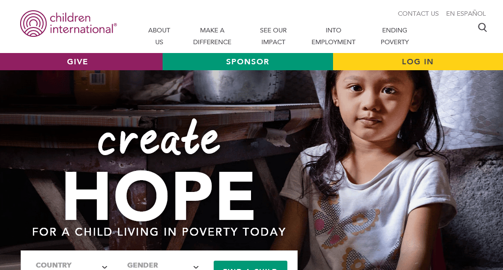
Children International helps children who live in poverty.
Why their site is excellent:
- The site uses scrolling images of children in the background. The overall design goes well with the brand image of the nonprofit organisation.
- Apart from the search box in the navigation bar, there is another search function that lets visitors search for children to sponsor. This is an excellent feature.
Website: children.org
11. Ford Foundation
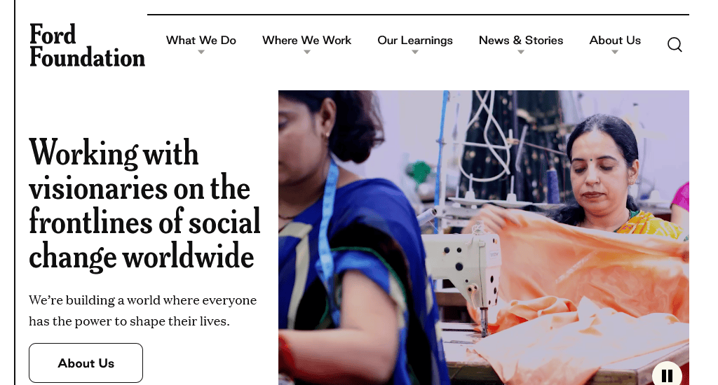
Ford Foundation is a private organisation with a mission to build a fair and peaceful world.
Why their site is excellent:
- Ford Foundation has a very simple website. But it’s organised and follows user-friendly design principles. The homepage features multiple banner images with links, which can be scrolled by clicking on the left or right arrows.
- The rest of the homepage contains a nicely presented section on news and blog posts, which can be filtered by type. The navigation bar is properly organised.
- All of the pages have a clean look, with lots of whitespace and elegant design elements. The site’s simple design choices make it more appealing.
Website: fordfoundation.org
12. buildOn
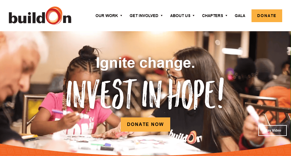
buildOn works towards breaking the cycle of poverty, illiteracy and low expectations through service and education.
Why their site is excellent:
- The homepage showcases their motto: Ignite change, Invest in hope, alongside a video slider that displays the videos of their work and the community they have worked for.
- It offers multilingual support that distinguishes this site from other nonprofit websites. Also, two highlighted call-to-actions, Donate Now and Take Action, make it easy to donate and join the buildOn movement.
- The sticky navigation bar remains fixed in place even while smoothly scrolling through the content and comes with five sections- Our work, Get Involved, About Us, Chapters and Gala.
- Both the design and colour palette maintain consistency throughout the entire website, perfectly complementing and aligning with the colour of their logo.
Website: buildon.org
13. Give Kids the World Village
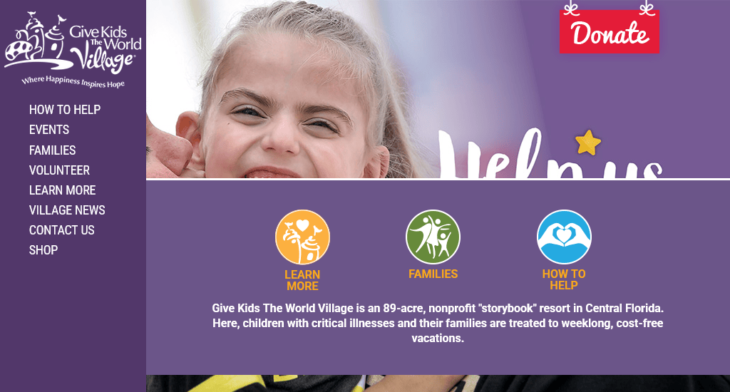
Give Kids the World Village is a nonprofit resort where families with children facing critical illnesses are provided with the extraordinary opportunity to embark on weeklong, fully sponsored vacations. You can take their site as a standard nonprofit website example.
Why their site is excellent:
- Give Kids the World Village utilises captivating images, an engaging layout, and a cheerful tone to convey its mission of bringing joyful moments to sick children.
- The sidebar menu shows what it offers to provide more information for interested users and allows one to navigate easily.
- The prominent Donate button remains accessible as visitors explore the website.
- The site appears equally impressive on mobile devices, with the contents seamlessly adjusting to fit smaller screen sizes.
Website: gktw.org
14. SpayMart
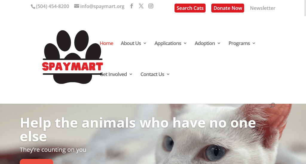
Operating as a lifesaving animal welfare organisation, SpayMart is working towards enhancing the lives of animals through programs directed at education, fostering, rescue, and affordable spaying/neutering.
Why their site is excellent:
- The website showcases charming cat and kitten photos on every page, complemented by a vibrant colour scheme. These visuals engage visitors, inspiring them to adopt, foster, donate, or volunteer.
- There is an interactive real-time tally that showcases the remarkable number of cats’ lives the organisation has positively impacted by rescue and care. Also, the homepage offers prominently displayed direct links that provide instant access to the organisation’s highlighted programs.
- The directory-style cat search page allows visitors to search cats by their breed, size, age, gender, care and behaviour.
Website: spaymart.org
15. Leukemia and Lymphoma Society
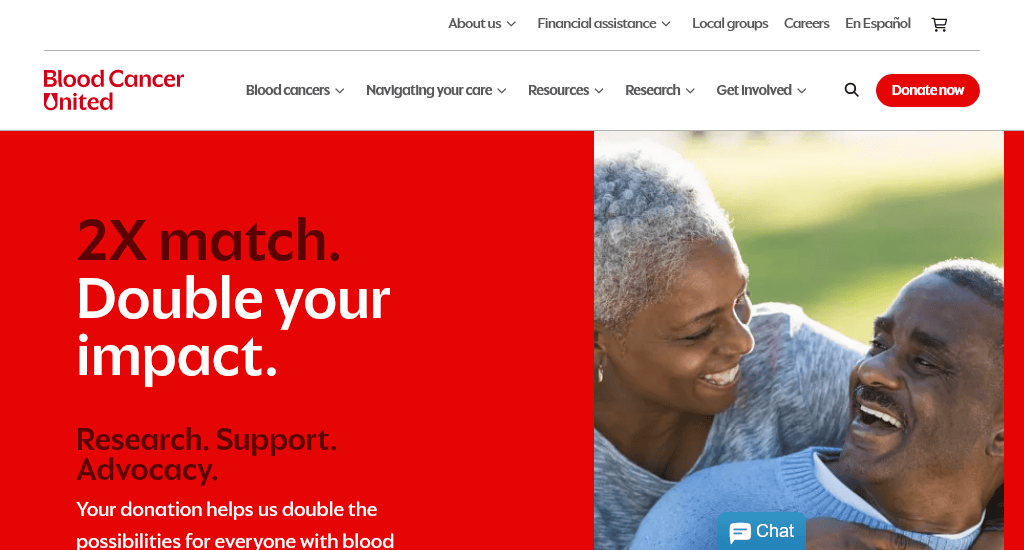
The Leukemia & Lymphoma Society (LLS) is one of the largest nonprofits dedicated to creating a world without blood cancers by investing in ground-breaking research, education and support.
Why their site is excellent:
- The homepage includes a slideshow of images that comes with individual CTAs, including Find and Event, Learn More and Donate Today. The rest of the homepage effectively introduces visitors to the achievements it has received and projects run by the organisation.
- The menus are tailored for distinct audiences- Patients and caregivers, Researchers and healthcare professionals. And this makes sense as they will look for different information.
- The numerous pictures of patients used on the site are effective enough to foster a sense of collective hope while showcasing inspiring tales of their journey and recovery.
- The design incorporates plenty of white space and just enough information to make the user experience convenient and not overwhelming.
Website: lls.org
5 proven tips for designing your next nonprofit website
Creating a nonprofit website is not just about putting information online — it’s more about building trust, inspiring action, and making it easy for visitors to get involved. When you have a well-designed site, you can ensure that your mission is clear, your values are visible, and every visitor can take the next step to support your cause.
Below are five practical tips that we picked, inspired by the mentioned nonprofit websites:
1. Keep it as simple and clear as possible
Clarity should be your first choice. Try to avoid cluttered layouts, heavy text blocks, or jargon that can end up confusing your visitors. Rather, try to send straightforward messages to communicate your mission in just a few words.
Charity: Water sets an excellent example on their homepage. It instantly explains who they are and what they do with simple visuals and concise copy. This approach mostly helps first-time visitors to immediately understand the organisation’s purpose without having to dig through several service pages.
2. Highlight your impact
People want to see the difference between the support you are providing and the services that others are offering. That is why it is an effective way to use real stories, photos, and measurable statistics and demonstrate the effectiveness of your site.
Feeding America is a standout example here — their website features images of everything from families to volunteers, to food distribution, along with impact data. This combination of human stories and hard numbers gives visitors both an emotional and rational reason to get involved.
3. Make the donation process easier
Donations are eventually the lifeblood of nonprofits. So, the giving process has to be quick, secure, and accessible from any page. When you are prominently placing a “Donate” button, as seen on Oxfam Australia and Red Cross, they make sure that the supporters don’t have to hunt for ways to contribute.
Even all of the organisations we have mentioned above kept the process simple with a clear call-to-action. It requires only minimal steps to complete the donation, and there are trust signals (like security badges) to reassure donors. Only when donating feels effortless, visitors are more likely to go for it.
4. Think mobile-first
Today, most users browse on their phones, which makes mobile-friendly design no longer optional — it’s essential. When designing your site, you have to ensure that your site loads quickly, buttons are easy to tap, and text is properly visible on small screens.
One Drop is an excellent example. It offers seamless transitions, interactive elements, and a visually engaging design that works just as beautifully on mobile as on desktop. If your site isn’t optimised for mobile, you might end up losing potential donors or volunteers even before they get introduced to your mission.
5. Update regularly
If you have an outdated website, it will make your nonprofit look inactive or unreliable. You have to maintain regular updates, whether through blogs, event listings, or news posts. This will show visitors that your organisation is active and transparent.
Habitat for Humanity follows this well with its “News and Stories” section. The site is consistently refreshed with new project updates and success stories. This not only engages returning visitors but also builds credibility and trust with new supporters.
Wrapping up
Nonprofit websites have different business purposes. But still, they need to follow the best practices of web design to provide the necessary information to their target groups and supporters.
Maintaining a good brand image is also another critical factor. Good-looking websites help nonprofits to reach more people and motivate visitors to advance their causes. If you are a web designer, you’ll find the above sites to be useful design inspirations.
On the other hand, if you run a nonprofit organisation, feel free to use these examples as samples for your new site. Regardless of size and type, all nonprofit companies deserve to have a solid web presence. After all, they are working for the greater good.
You read a lot. We like that
Want to take your online business to the next level? Get the tips and insights that matter.